今天已进入24节气中的霜降,《二十四节气解》中说:“气肃而霜降,阴始凝也。”可见“霜降”表示天气逐渐变冷,开始降霜。北京的天气也格外应景,从早上就开始淅淅沥沥下雨,呆在屋里,甚至窝在被窝里,都感觉凉凉的。时间过得真快,刚毕业的时候还是三伏天的夏季,转眼又在北京迎来了冬季~

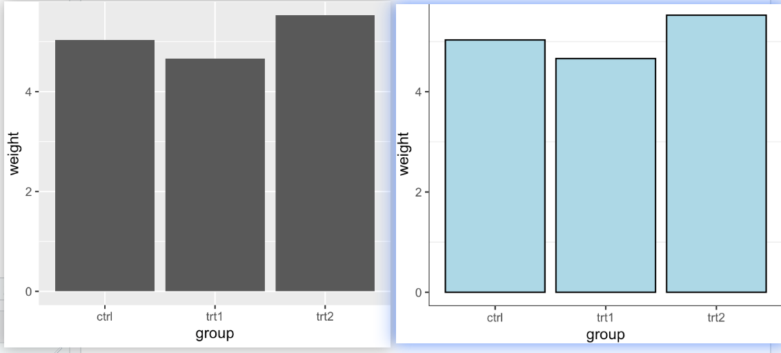
条形图是常见的一种数据可视化方式,常用于表示类变量(x)对应的数值(y)。这里以ggplot2示例展示如何设置绘制简单的bar plot,如何设置其他图形参数,以及进阶的bar plot示例展示。
ggplot2中绘制条形图的函数有geom_col()和geom_bar()。
条形图的填充色,边框色,背景色和背景框线的设置
1 | ## 简单的条形图 (左图) |
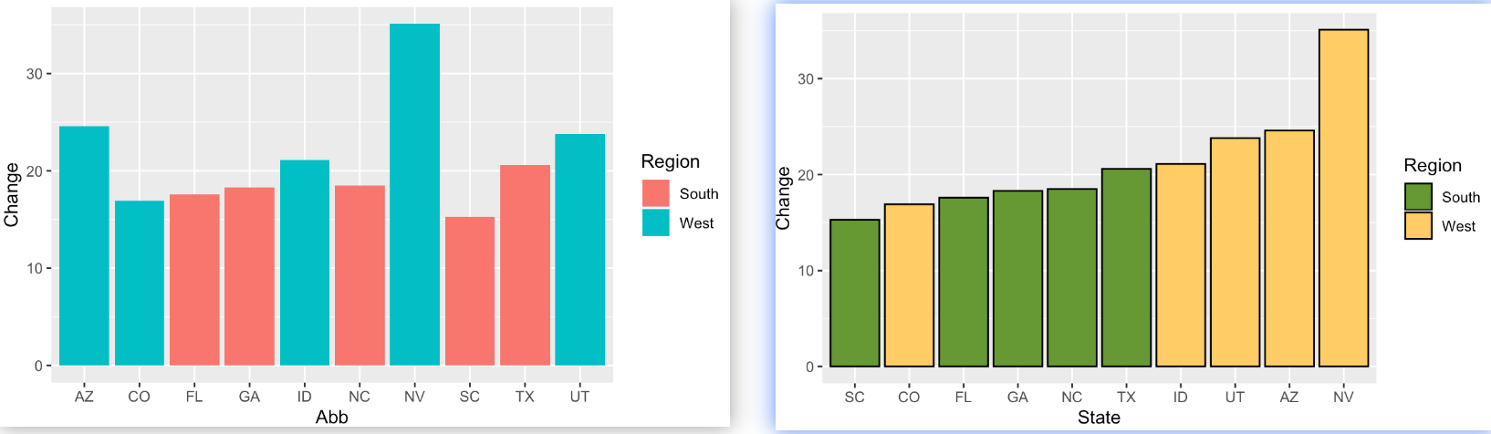
填充色设置和变量排序
非默认的填充色设置可以借助scale_fill_brewer() 或 scale_fill_manual(), 对变量的排序:reorder()函数,这里是基于Change的变化对Abb排序。
1 | ## 输入数据处理 |
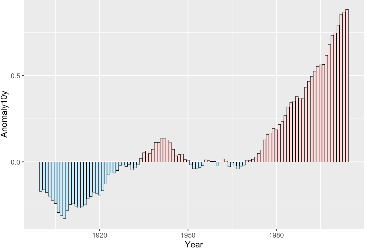
不同颜色表示正负数值的变化
1 | ggplot(climate_sub, aes(x = Year, y = Anomaly10y, fill = pos)) + |
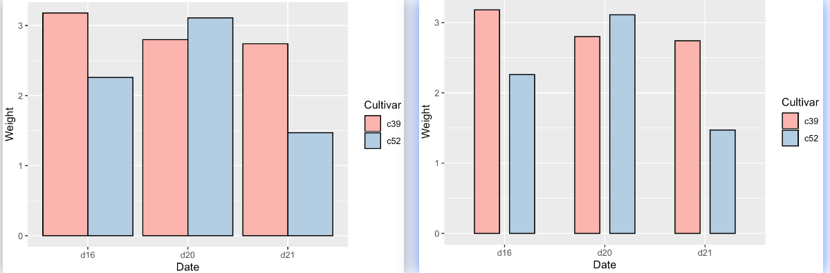
一对变量,调整bar的宽度和空间
1 | ## 一对变量水平同时展示 dodge |
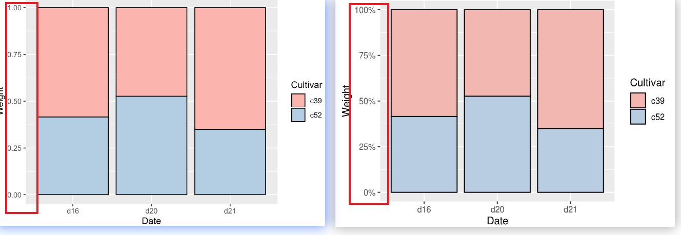
堆积图
1 | ## position_stack(reverse = FALSE) 堆积图的顺序调整,guide_legend(reverse = TRUE):legend顺序调整 |
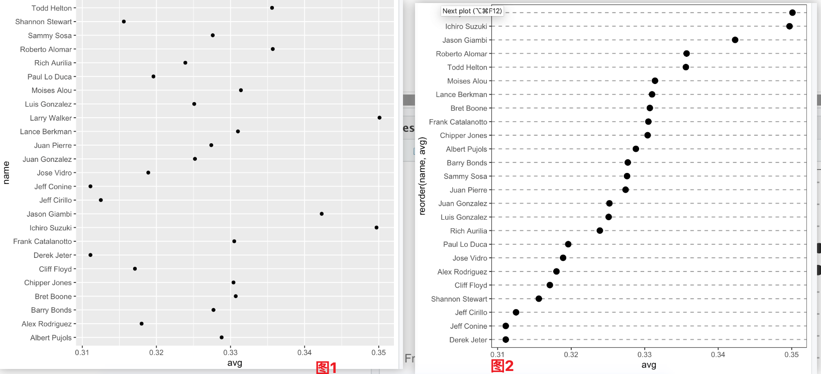
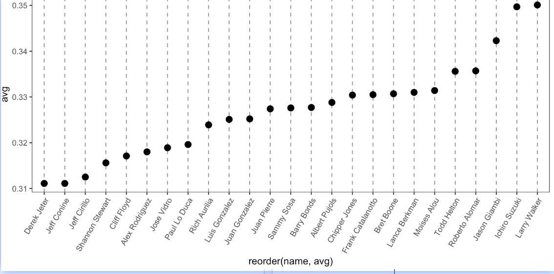
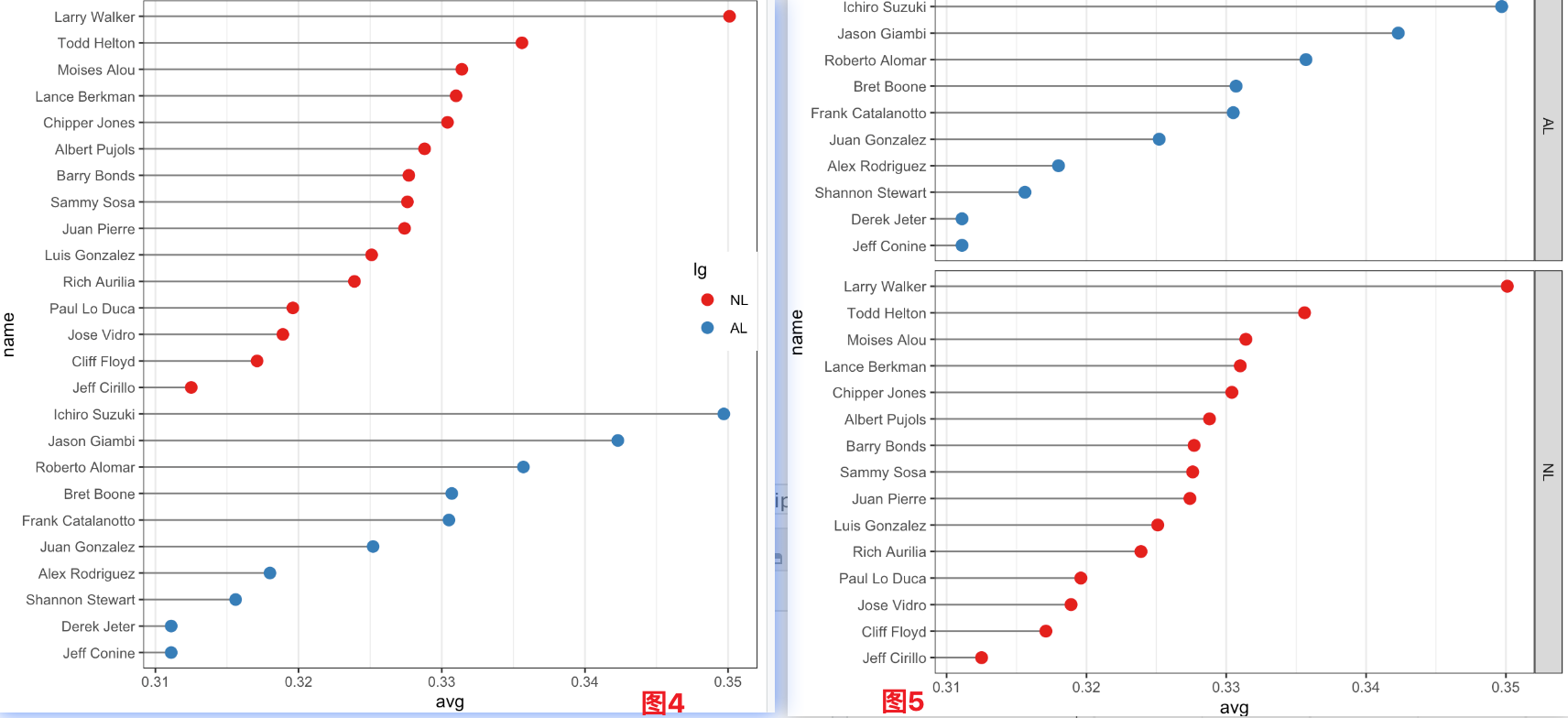
圈圈图 Dot plot
1 | ## 图1;dot plot: geom_point() |