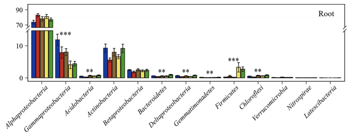
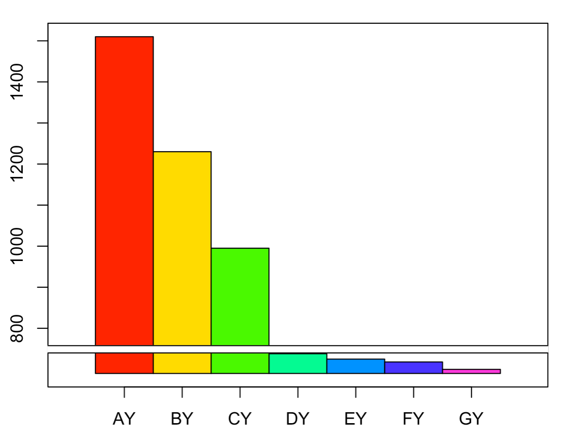
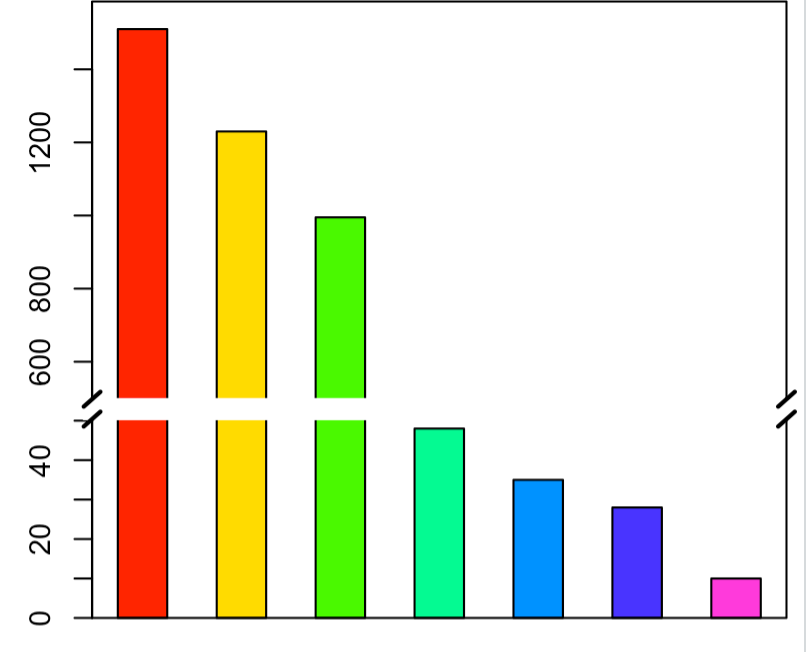
画图时经常遇到不同组的数据大小相差很大,大数据就会掩盖小数据的变化规律,这时候可以对Y轴进行截断,从而可以在不同层面(大数据和小数据层面)全面反映数据变化情况,如下图所示。
搜索截断图绘制的方法,有根据Excel绘制的,但是感觉操作繁琐;这里根据网上资料总结基于R的3种方法:
- 分割+组合法,如基于ggplot2, 利用
coord_cartesian()将整个图形分割成多个图片,再用grid 包组合分割结果 - plotrix R包
- 基本绘图函数+plotrix R包
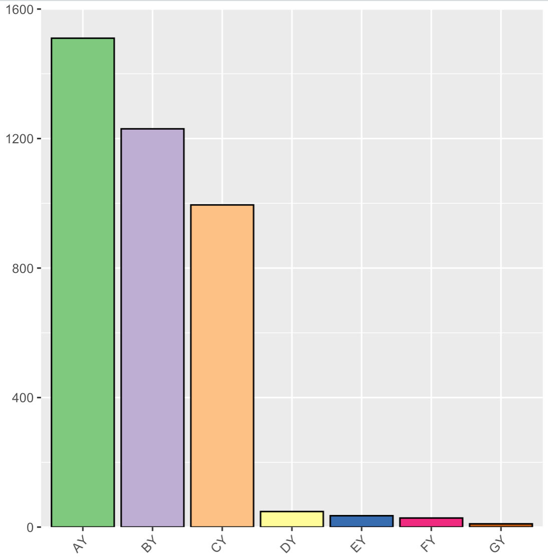
示例数据
1 | df <- data.frame(name=c("AY","BY","CY","DY","EY","FY","GY"),Money=c(1510,1230,995,48,35,28,10)) |
方法一:分割+组合法
这种方法的思路是分别绘制不同层级大小的图形,然后组合图形。如可一用ggplot2中的coord_cartesian()函数分割,ylim指定y轴的区间范围。
1 | ### 小数据层级 |
P1
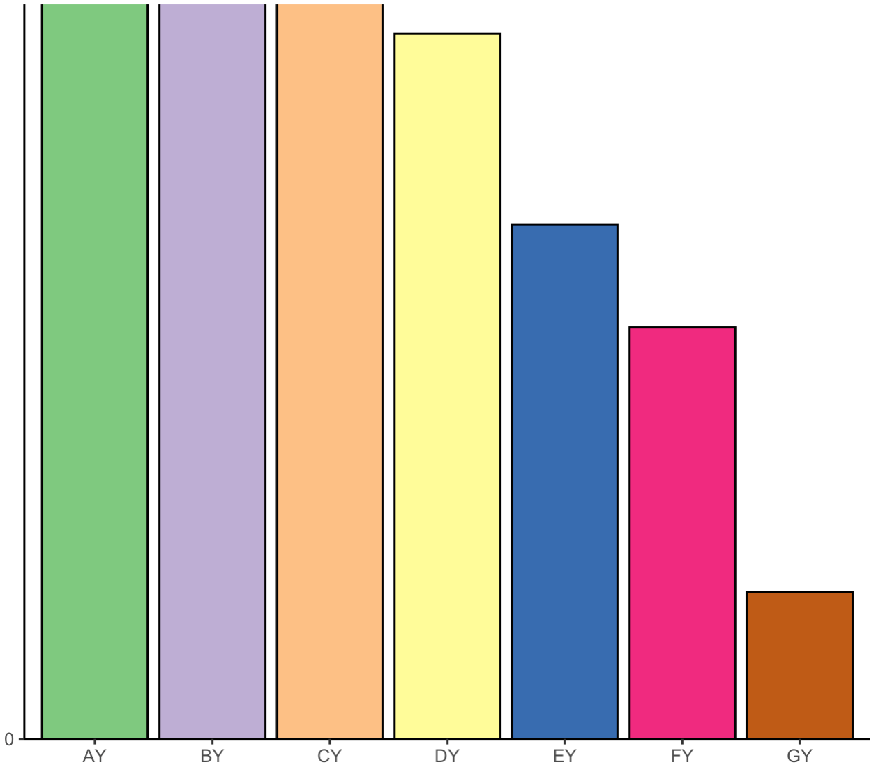
p2
grid组合图形, grid.newpage()新建画布, viewport()命令将画板分割为不同的区域。
x和y分别用于指定所放置子图在画板中的坐标,坐标取值范围为0~1,并使用just给定坐标起始位置;width和height用于指定所放置子图在画板中的高度和宽度。
1 | library(grid) |

这种方法可以得到一个草图,图片对齐等细节调节需要多次尝试,或者可以导出在AI中修改。
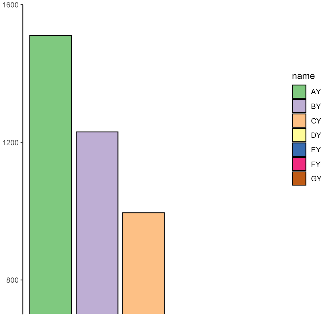
方法二:plotrix R包
plotrix R中包含gap.plot(),gap.barplot() 和 gapboxplot()函数, 可以分别画出坐标轴截断的散点图、柱状图和箱线图。主要参数包括y :要截断的数值向量; gap:截断的区间.
1 | ### 用法如下 |
参考:http://www.bioon.com.cn/protocol/showarticle.asp?newsid=66061
相同的数据,画图如下
1 | #install.packages ("plotrix") |
接着使用axis breaks()函数去除中间的两道横线,并添加截断的标记,如//或z。
Axis:1,2,3,4分别代表下、左、上、右方位的坐标轴,即打算截取的坐标轴breakppos:截断的位置,即截断符号添加的位置style: gap,slash和z字形
1 | axis.break(2,50,breakcol="snow",style="gap") ##去掉中间的那两道横线; |
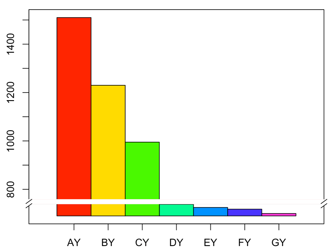
这种方法是基于base plot绘图的,但是base plot的许多绘图参数与gap.barplot()并不兼容,如space和width参数设置离坐标轴距离和bar的宽度。
方法三:基本绘图函数+plotrix R包
参考:https://blog.csdn.net/u014801157/article/details/24372371
作者ZGUANG@LZU自己编写的函数,可以手动设置断点,也可以由函数自动计算。断点位置的符号表示提供了平行线和zigzag两种,并且可设置背景颜色、大小、线型、平行线旋转角度等。
函数
1 | #' 使用R基本绘图函数绘制y轴不连续的柱形图 |
示例数据
1 | datax <- na.omit(airquality)[, 1:4] |
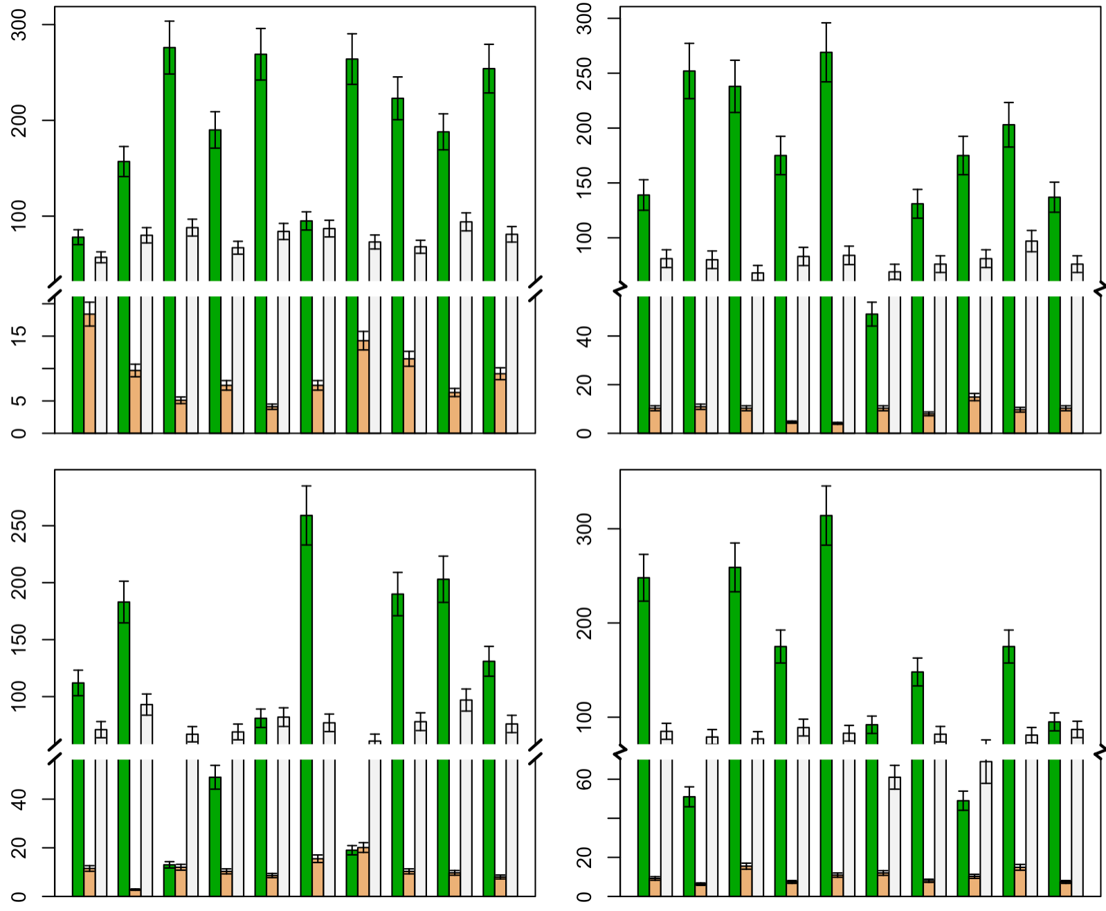
实际数据
1 | gap.barplot(df, y.cols = 2, brk.type = "normal",col = rainbow(7), |
第3种方法可以直接计算截断值,另外可以添加error bar, 可以修改的细节处更多,而且包装成函数,整个分析时间也加快。